Central Catskills Chamber of Commerce
Get Away / Give Away Promotion
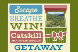
BROCHURE EXTERIOR

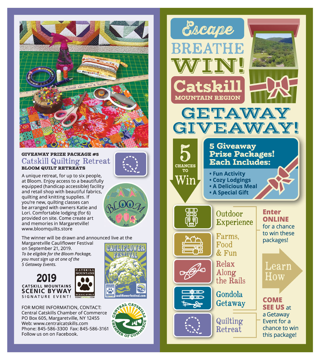
BROCHURE INTERIOR
MAKING A POTENTIALLY COMPLICATED CONCEPT CLEAR WHILE ENTICING VISITORS TO SIGN UP: The client needed to develop a database of information about tourism visitors. The plan was to enticed visitors to sign up for a chance to win a weekend vacation package.
There were several design challenges: Create a look that communicated rural funky fun; Communicate different types of vacation packages; Communicate the package without having photos available; Distinguish between packages available when signing up online vs. a premium package only available by signing up in person at a local event; Indicating local events where one can sign up.
Catskills Addiction Coalition
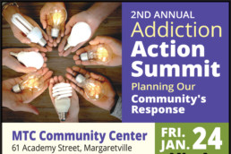
Addiction Recovery Summit
Community Outreach / Avoiding Sterotypes
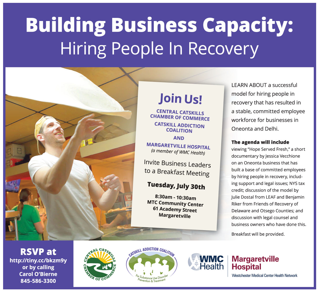
BUILDING BUSINESS CAPACITY: A breakfast meeting invitation by the Catskills Addiction Coalition to regional businesses. The goal: to create an attention grabbing ad, encouraged business leaders to attend, spotlight event sponsors, project an upbeat feel about the advantages of hiring people in recovery, avoid sterotypes.

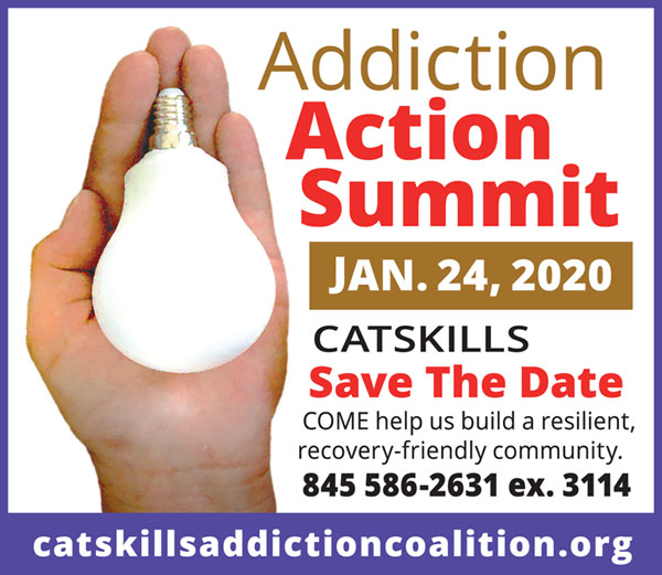
ADDICTION ACTION SUMMIT FLYER
The goal: establish a postive, attention grabbing image; express community, positive idea sharing; avoid stereotyped images of addiction.
The graphic chosen was adapted to B&W for regional supporters to more easily print and distribute using desktop printers. The graphic was used for social media as well.
SAVE THE DATE AD
The goal: Adapt the Summit flyer graphics for use in a very small ad space and still be attention grabbing.

ADDICTION ACTION SUMMIT AD
The goal: Adapt the Addiction Action Summit flyer to ads of varying sizes; maintain a consistant look and message.
CAMPAIGN RESULT
Over 179 people attended exceeding room capacity.
Open Eye Theater
Three Poster Challenges
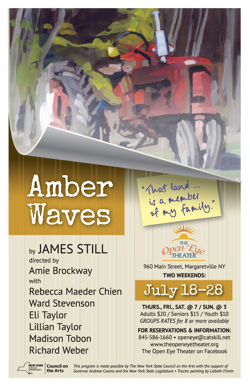
AMBER WAVES, is a play about the challenges behind the idyllic stereotype of family farming. Artist Lisbeth Firmin donated the use of her tractor painting for their poster. The image was beautiful, but Open Eye Theater felt it alone might not tell the story. Silvertop Graphics was hired to design a poster told the story and grabbed attention. The design was also used in flyers and custom invitations.
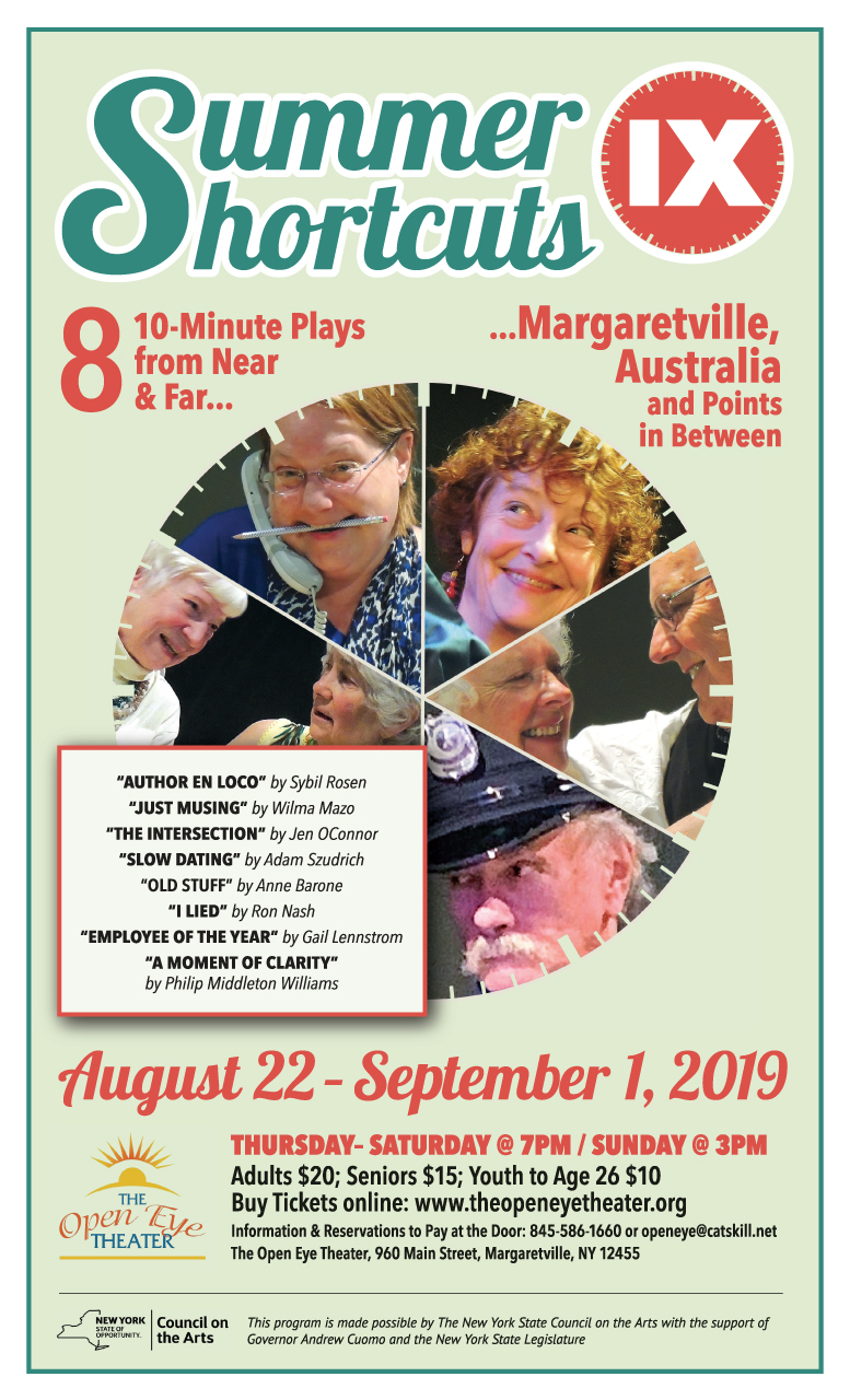
SUMMER SHORTCUTS 9: Ninth in a series of 10-minute plays. OET had struggled in the past to create a poster image that communicated the short form concept, give each play equal emphasis and created a simple, compelling, overall graphic. We were hired to solve that design challenge.
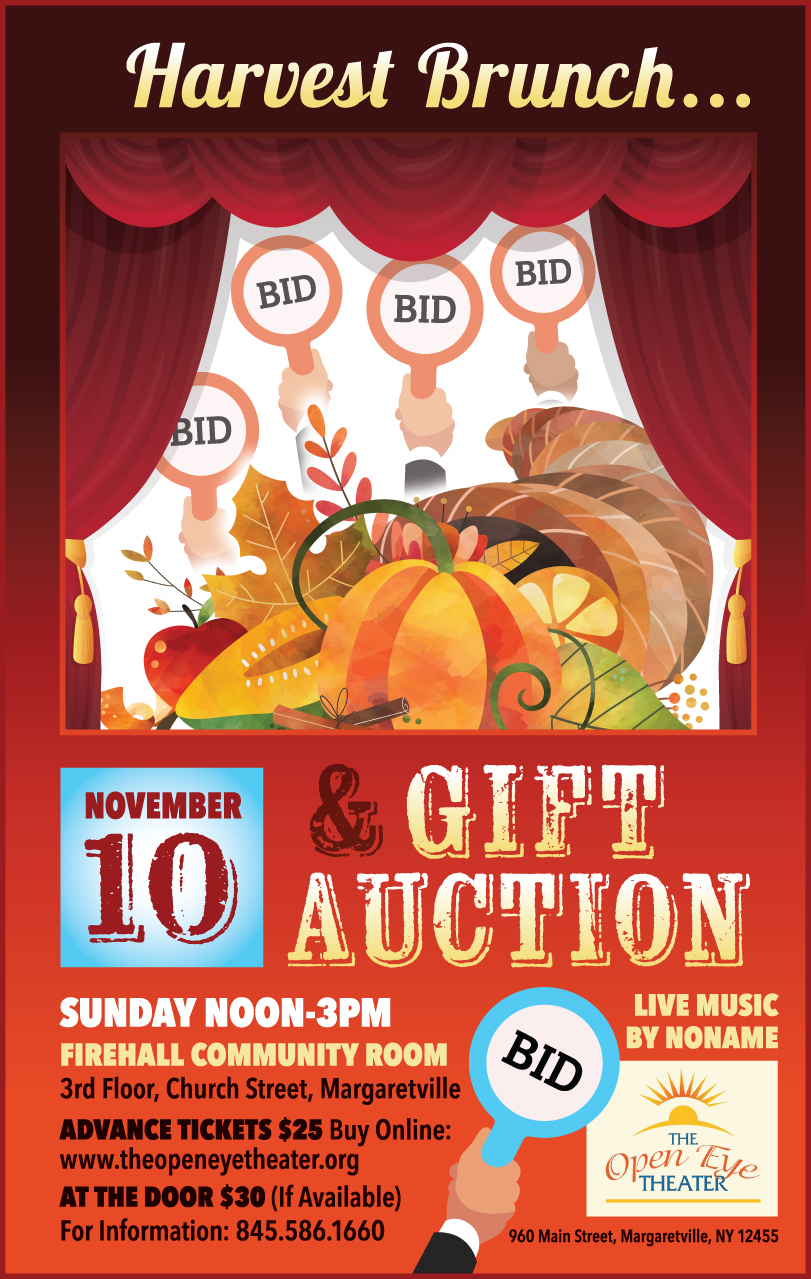
THE HARVEST BRUNCH is an annual fundraiser event. The design challenge was to get supporters to understand it was a two part event. People were coming for the brunch but not understanding the auction was the important part of the fundraiser. We were hired to create a poster that felt fun and inviting while balancing the ideas of harvest, theater and auction.
West Branch Artists
WBA: Indentity Design / Web / Event Launch
 WBA LOGO — Silvertop Graphics worked with WBA members to create a lively logo that could apply to any of the creative arts and imply an important feature of the Walton NY community — the West Branch of the Delaware River.
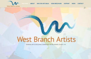
WBA WEBSITE — We developed a Wordpress site for WBA with the immediate focus on their first self guided art tour. The site provided promotional and event support information.
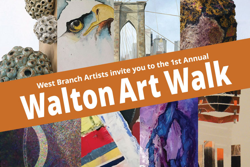
WBA ART WALK — we designed a variety of collateral print promotion pieces that included a brochure, post card, poster, print and social media ads plus lawn signs.

Fleischmanns In Verse A History
Quirky Telling of a Village Story
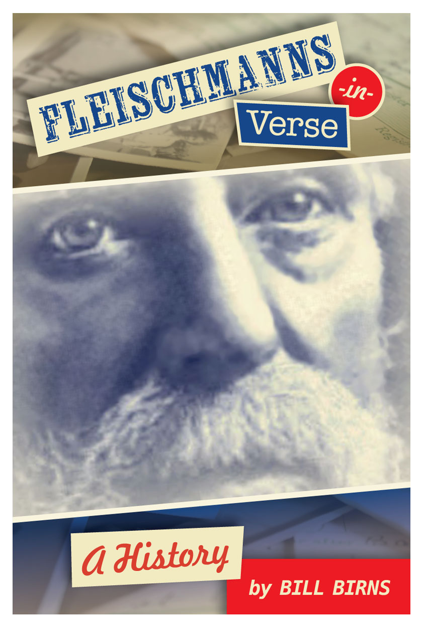
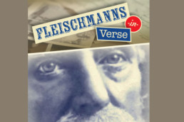
FRONT COVER
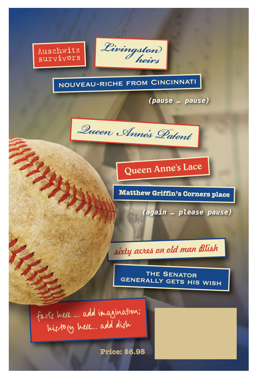
BACK COVER
BACK COVER
FLEISCHMANNS IN VERSE – A HISTORY. An unusual history of the story behind the story of a village published in an anniversary year. The design needed to capture the unusual nature of the story, the way it was told and evoke curiosity.
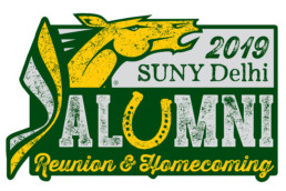
SUNY Delhi Alumni Logo
Alumni Reunion & Homecoming Branding
SUNY DELHI, NY, hired us to create a logo for annual alumni events. They wanted something suitable for promotion and products for sale. It needed to capture school logo elements combined in a way that captures the fun of a reunion and homecoming. The year type in the upper right was set up to be easily updated by the client.